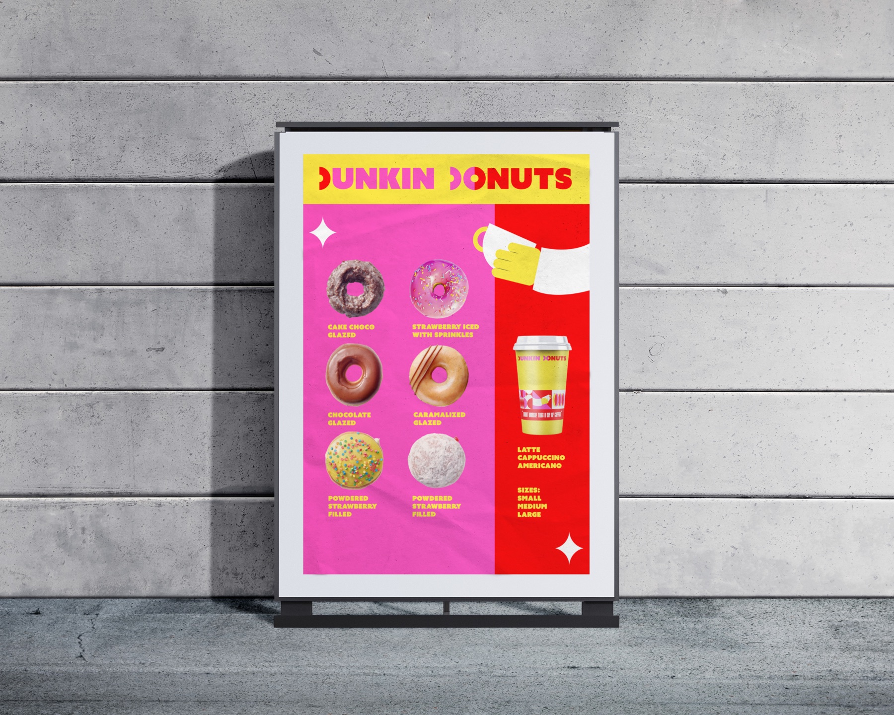
Dunkin Donuts
Brand identity — rebrand
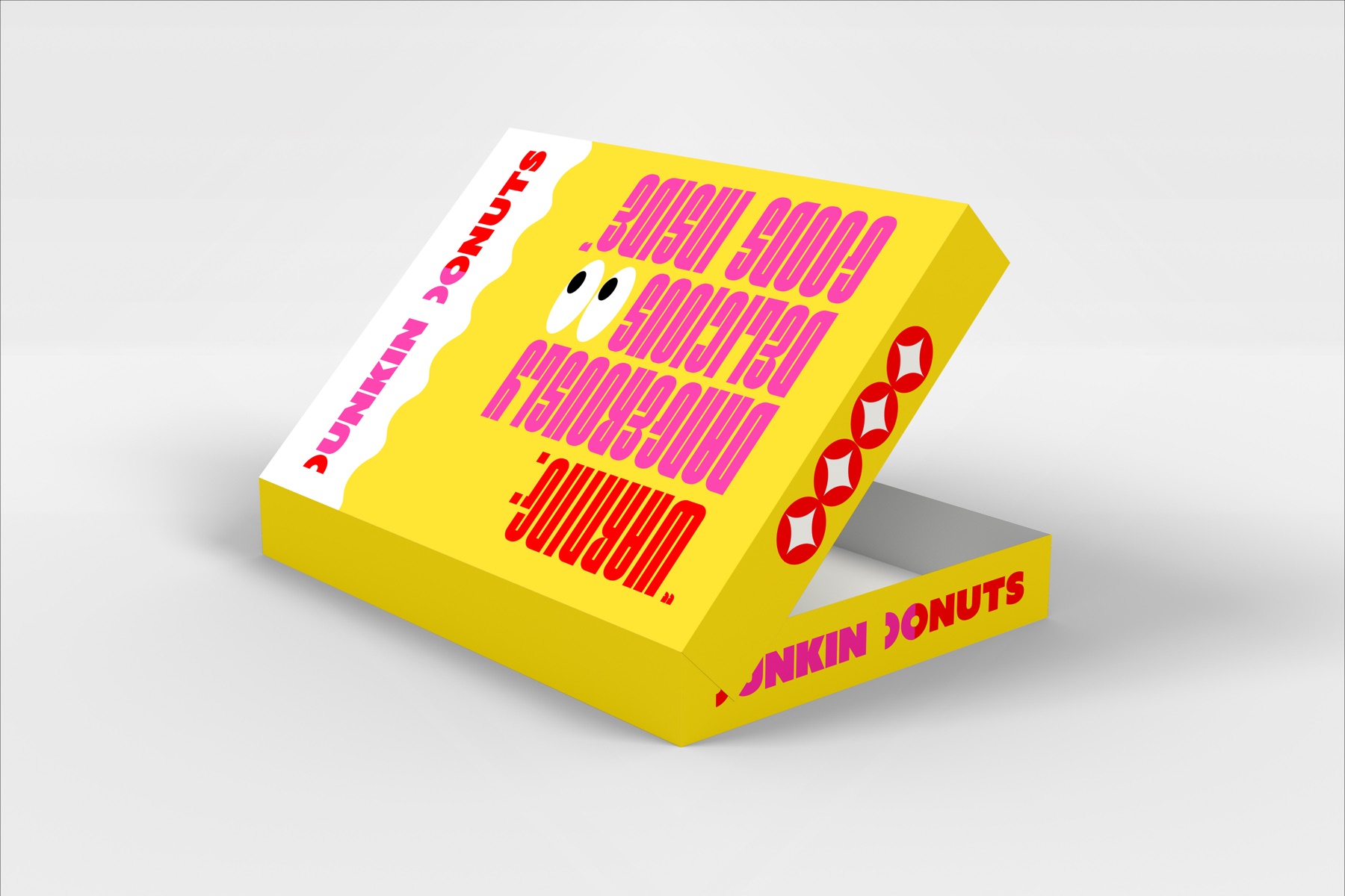
A rebrand that drops the rounded, friendly Dunkin of the last decade for something louder — a wordmark cut from geometry, a hot palette of yellow, pink and red, and packaging that talks back to whoever is holding it.
Personal project. Not commissioned by, affiliated with or endorsed by Dunkin’ Brands. All existing Dunkin’ trademarks belong to their owner; this is a speculative student proposal shown as portfolio work.
New logo
The wordmark

How it is built
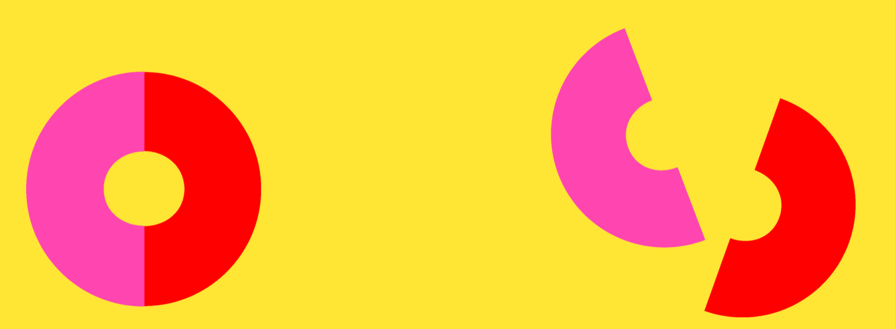
Two halves of a donut
The D is a ring split down the middle and pulled apart — one half pink, one half red — so the letter is the product. Very simple, minimal, shape-like: every other letter is cut from the same circles and straight edges, which is what lets the mark hold together at any size and read from across a room.
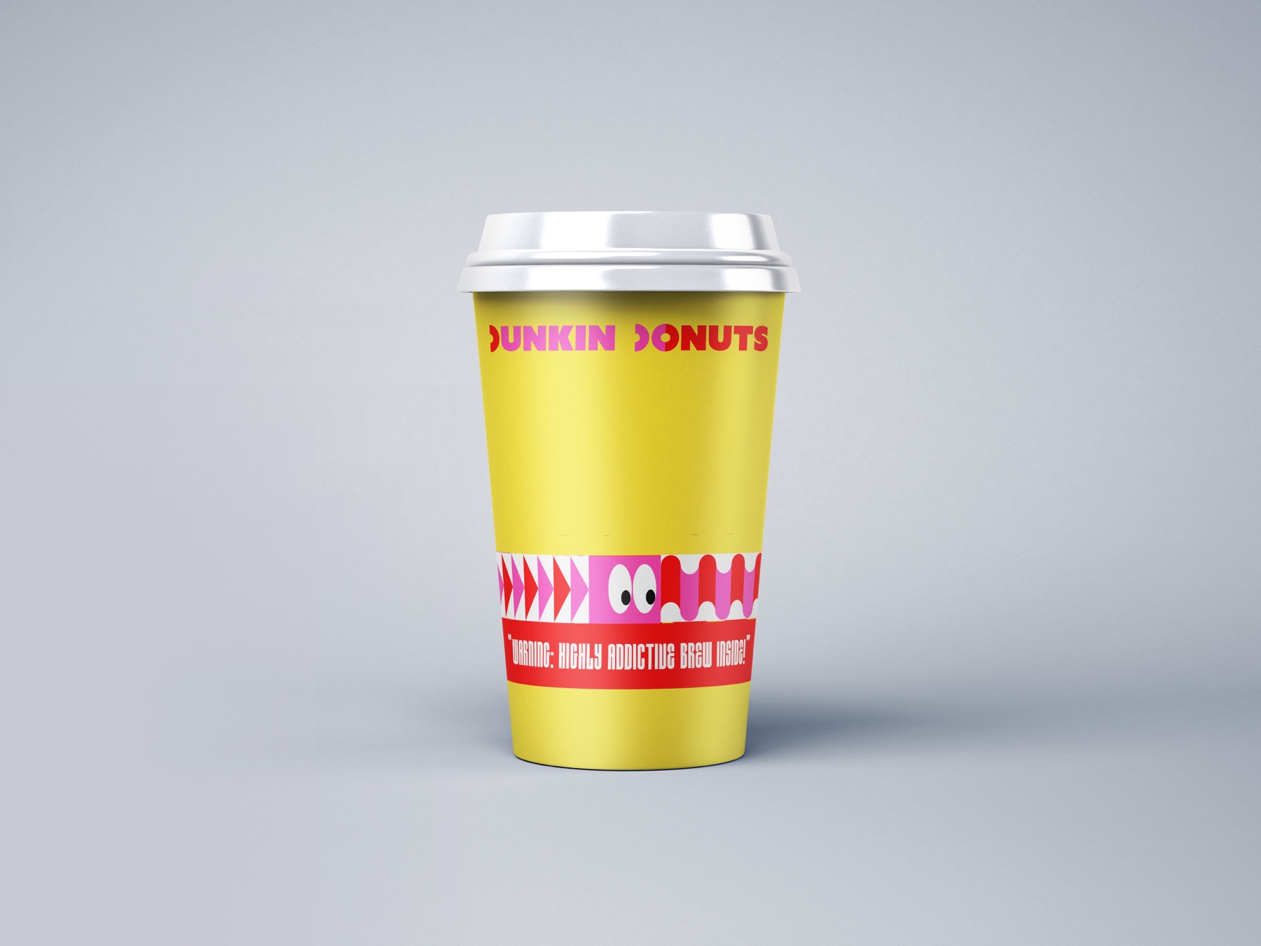
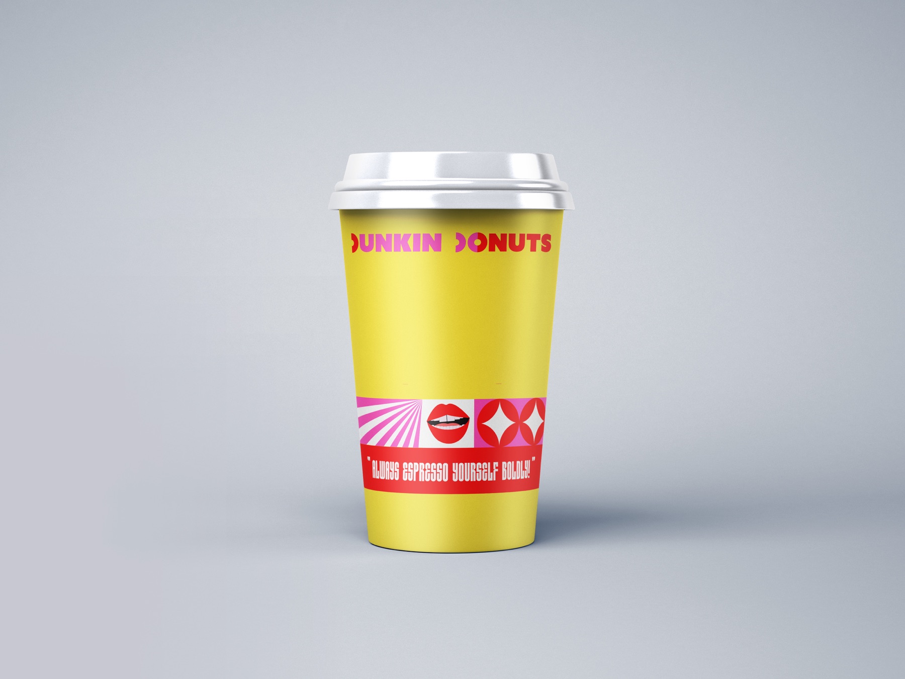
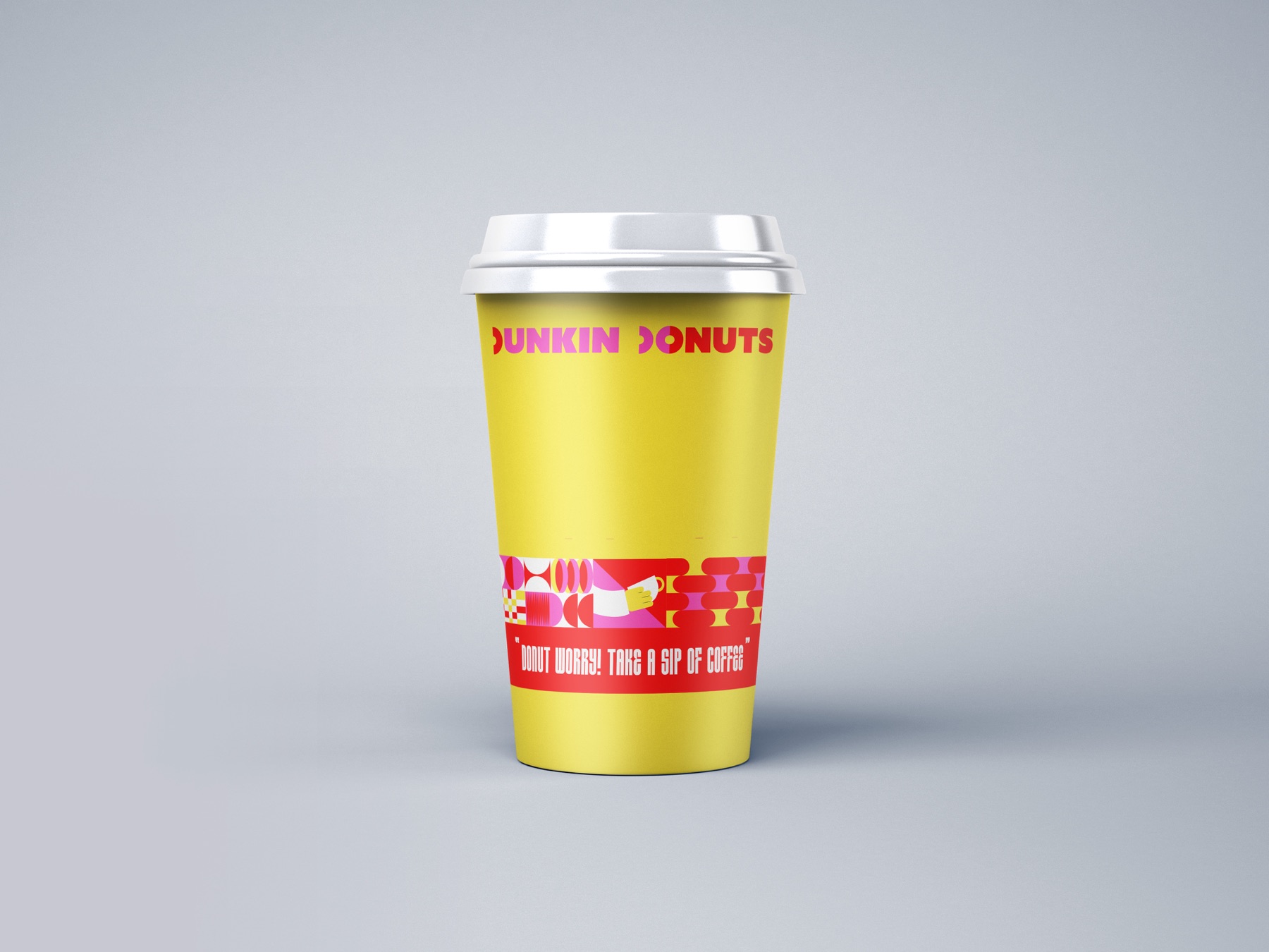
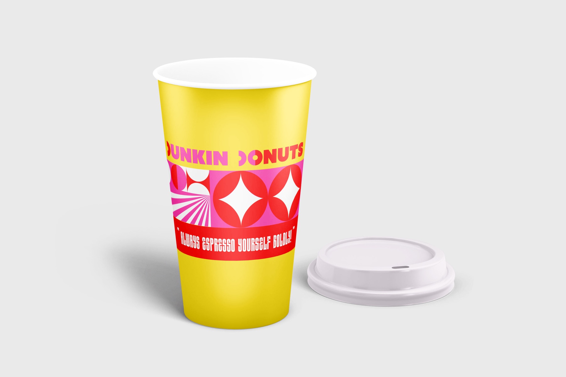
Coffee cups
One sleeve per line of copy
Single donut pack
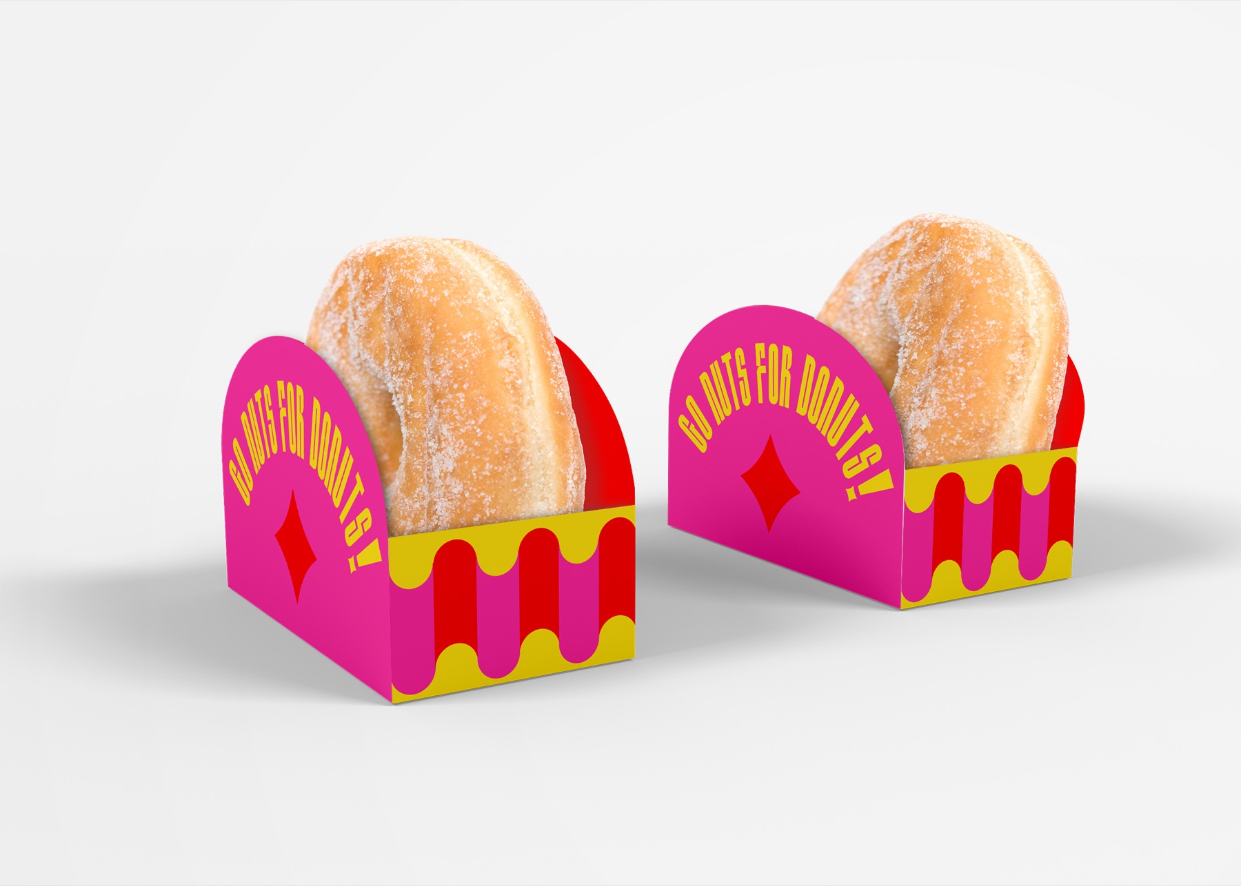
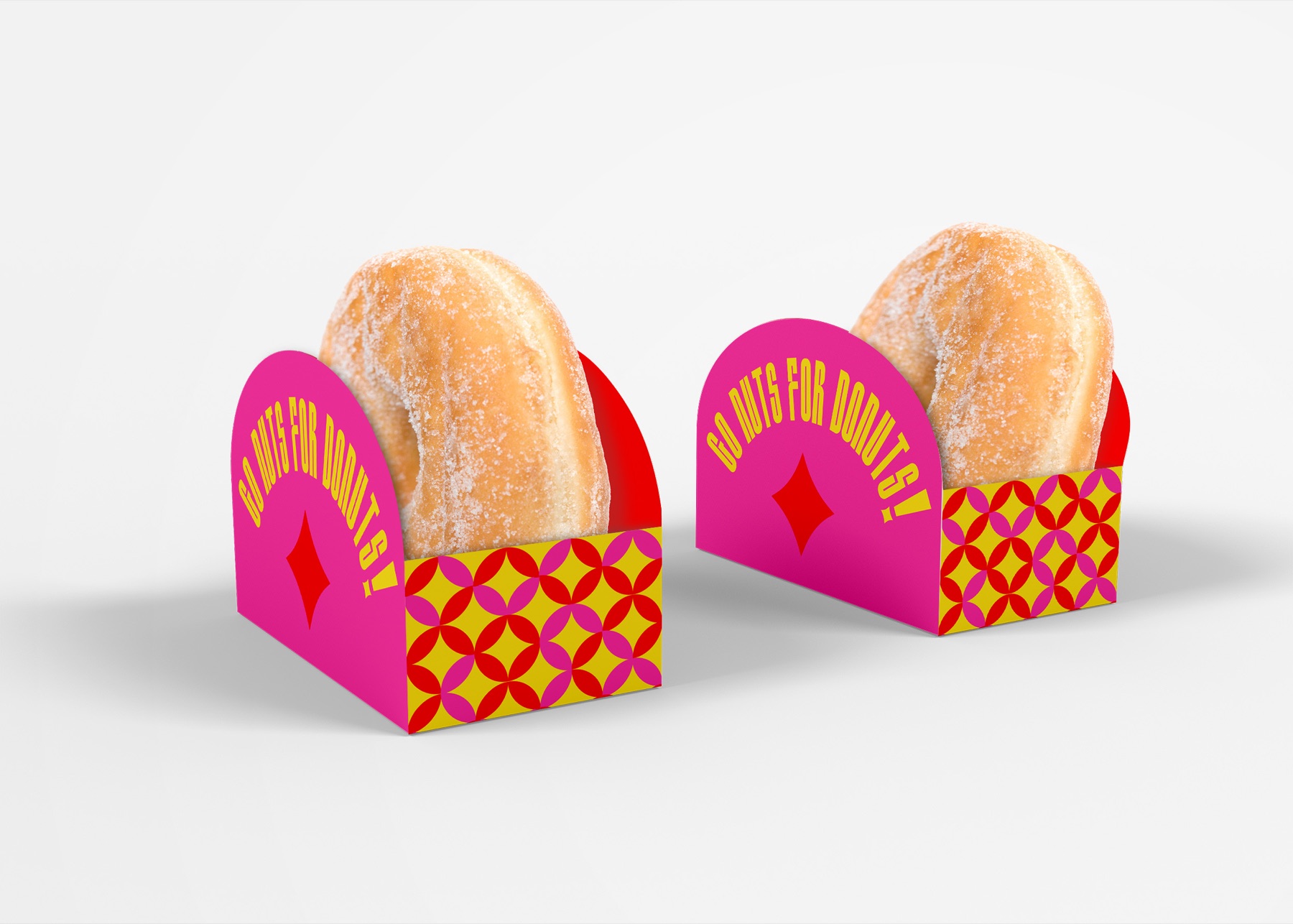
Two pattern variants
Twelve pack
Box
Menu
In store